




Listeners:
Top listeners:
00:00
00:00
volume_up
chevron_left
-
 play_arrow
Revolution Radio Your home for the best variety of Christian music
-
 play_arrow
Heartland Newsfeed Radio Network Heartland Newsfeed Radio Network
-
play_arrow
Heartland Newsfeed Radio Network (Abovecast Backup) Heartland Newsfeed Radio Network
-
 play_arrow
Home For The Holidays Radio
-
 play_arrow
How Do Other Countries do Healthcare? Andrew Heaton, Sally Primus
Improving print results for regional newsletters
AD
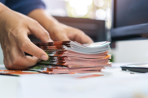
Printing a regional newsletter sounds simple until the final stack lands on your desk. You notice color bleed and suddenly your message feels less credible. You don’t need a full redesign to fix it. Improving print results for regional newsletters starts with smarter production choices that strengthen consistency.
Start with stronger paper choices
Paper drives everything. Thin stock absorbs too much ink, which leads to dull visuals and soft text edges. Heavier paper creates a cleaner surface, so ink stays where it should and details stand out. A slight upgrade changes how pages feel in hand and how long they hold up in circulation.
Control ink and layout balance
Ink and layout work together. If one falls short, the entire page suffers. Dense graphics, tight margins, heavy text blocks, and uneven spacing can overwhelm lighter paper and cause visual distortion.
Strong layout choices keep everything in check. Clear spacing, intentional margins, and balanced image placement guide the reader’s eye and protect print quality. When you align ink usage with layout structure, you preserve crisp results across every page.
Dial in printer performance settings
Even the best materials fail without proper calibration. Printers need regular adjustments to maintain reliable output. Default settings rarely match the needs of high-volume newsletters.
Focus on key adjustments that directly affect output quality: resolution settings, print speed, ink distribution, and alignment calibration. When you fine-tune these elements together, you improve consistency and extend the life of your equipment. Each adjustment builds toward a more reliable final product.
Match materials to real-world use
Regional newsletters don’t sit untouched. Consider how your newsletters move through the world:
- Frequent handling across job sites and public spaces
- Exposure to environmental conditions
- Folding for mailing, storage, or distribution
- Repeated reading over extended periods
When your materials match these conditions, your content stays intact and readable longer. That reliability reinforces your message every time someone picks it up.
Refine consistency across every issue
Consistency builds recognition. Readers expect the same quality every time they open your newsletter. If one issue looks sharp and the next looks faded, trust drops.
Small adjustments create stability. For example, using a slightly heavier stock improves ink control and reduces show-through. When production choices stay consistent, your publication develops a recognizable standard that readers rely on.
Strengthen results with smarter workflows
Take a closer look at your current process. Where do issues show up first? Fix those pressure points and track the results. Over time, your workflow becomes more predictable and your output more refined.
Regional newsletters carry important updates, public information, and community voices. When print quality supports those messages, your work reaches people the way you intended. Keep refining your approach, and each issue will land with more clarity and impact than the last.
AD
 Nokomis, IL
 61°F
Feels like 61°F°L: 61° H: 61°
61°F
Feels like 61°F°L: 61° H: 61°
AD

AD